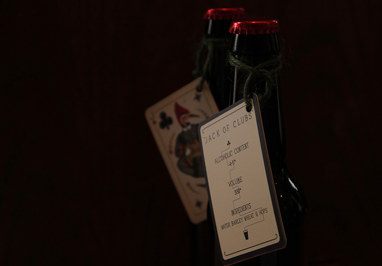
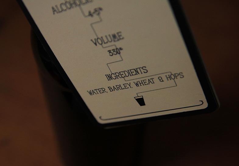
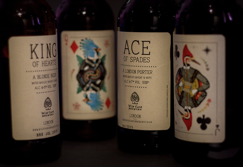
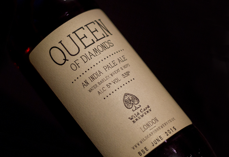
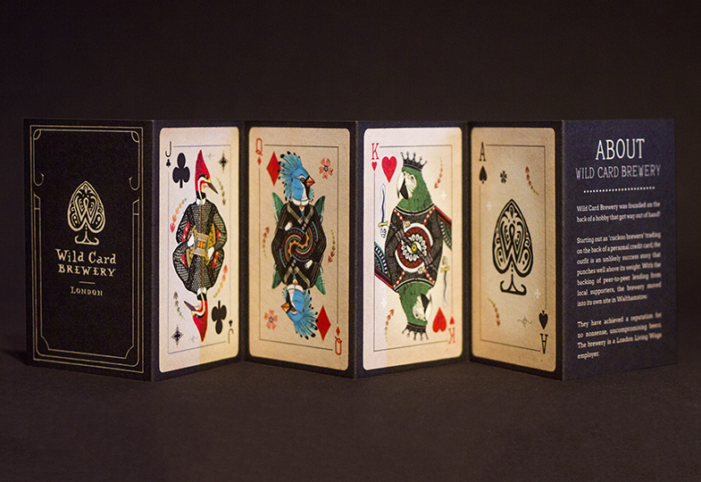
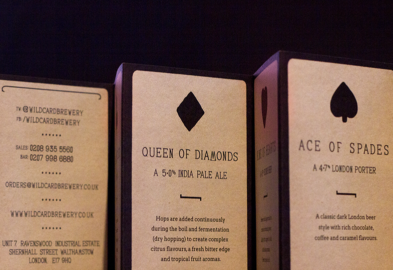
Design for Wild Card Brewery beer labels and promotional leaflet.
Both the design and typography are based on historical references to reflect the traditional brewing process of the brewery.
The logotype is based on text taken from taxation stamps used for playing cards in the 19th century. All other typography derives from an early 20th century card game.
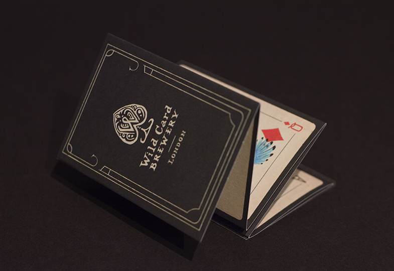
The concertina leaflet was printed to the size of a playing card offering a more playful interaction, as though the user is shuffling a deck of cards.
